Catapult Strategic Design
We’ve established ourselves as the ‘Go To’ Branding Agency in Tempe, AZ.
Whether you are in need of Branding, Marketing, Product Design, Advertising, Collateral Materials, or Website Design
Whether you are in need of Branding, Marketing, Product Design, Advertising, Collateral Materials, or Website Design
Table of Contents
Case Studies
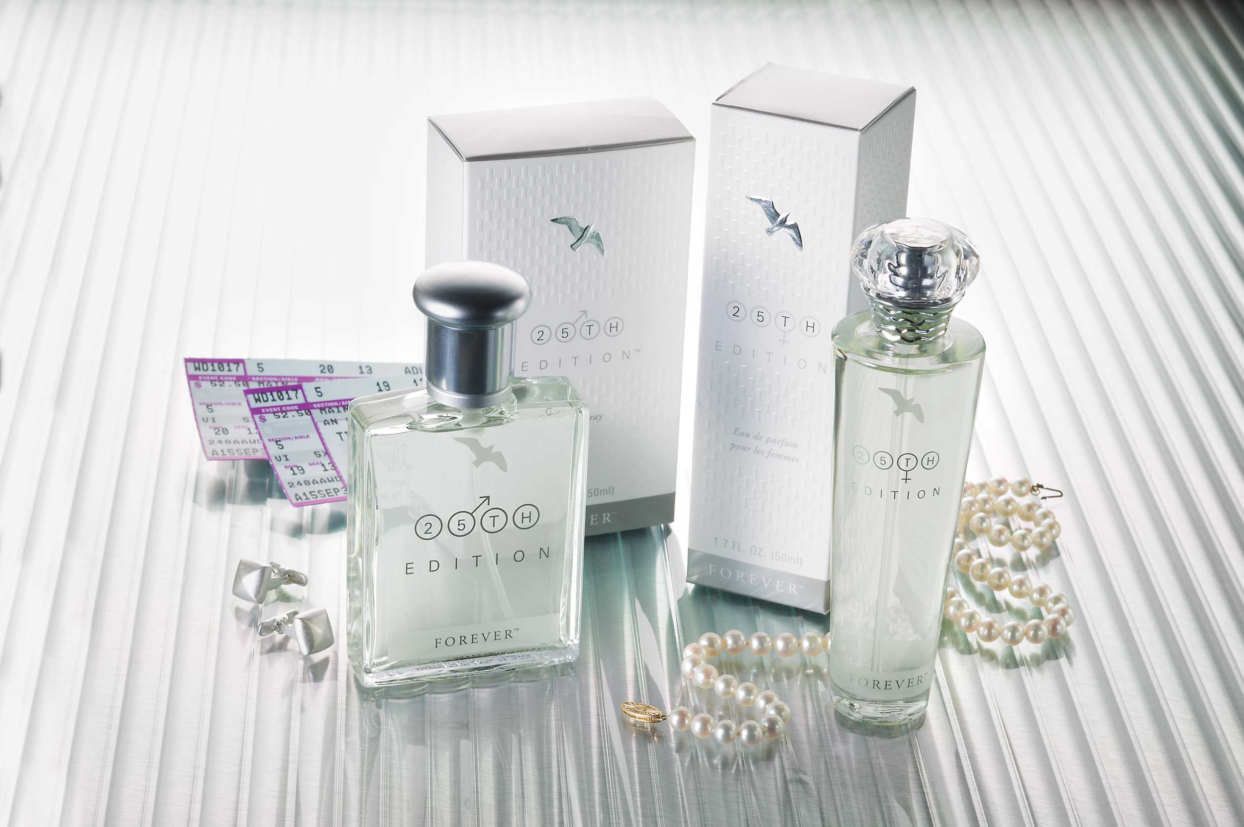
Forever Living Products is a $2.6 billion company known for providing high quality products. They are also well known for owning or controlling every aspect of the production process.
Leverage existing brand and packaging equity to enhance dozens of products across seven key product lines. The seven product lines are drinks, nutrition, bee products, weight management, skin care, Sonya, personal care.
Develop a line of packaging that accurately promotes the brand identity. Each design should improve the perceived quality and enhance the value the product provides in the lives of its users.
Catapult developed new, higher-end packaging for over 50 SKUs for FLP’s product manual. This process was executed over the course of about 10 months. FLP experienced significant sales volume increases and credited Catapult with playing an important role in these results. Other marketing projects included: collateral materials, network marketing and promotional support, tradeshows, and environmental design.
Shamrock Dairy’s brand perception among consumers was very different from management’s self-perceptions. They were viewed by consumers as a large corporate entity that were disconnected from real dairy. Shamrock reached out to our branding agency to help.
Implement changes to the brand name and its identity to modify buyer perceptions of the brand.
Leverage the positive heritage and brand equity of the Southwest’s largest dairy among consumers.
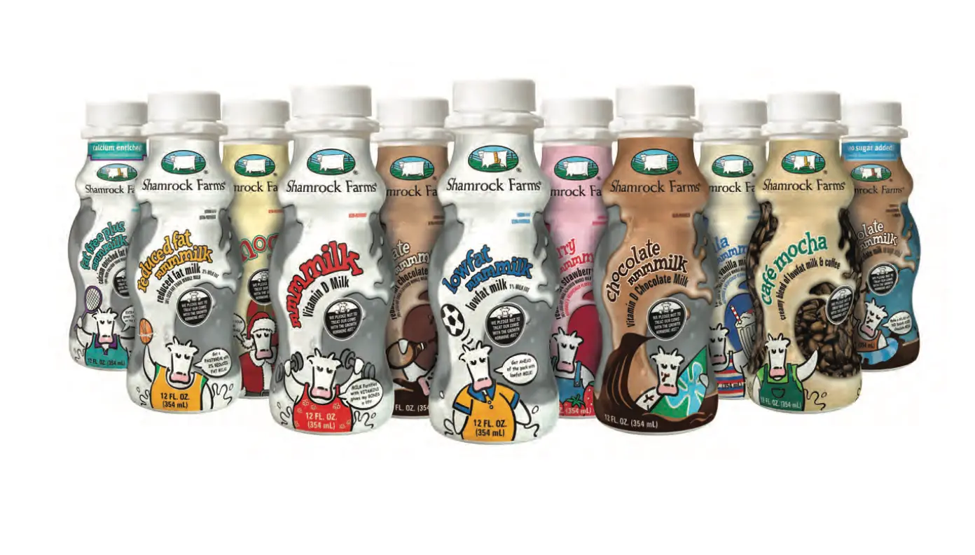
Shamrock Dairy’s name was changed to Shamrock Farms with a new, more inviting identity. A multitude of new, consumer-friendly products reinforced the brand quality and authenticity. All this helped to improve the public perception of this national, though still family-owned, business.
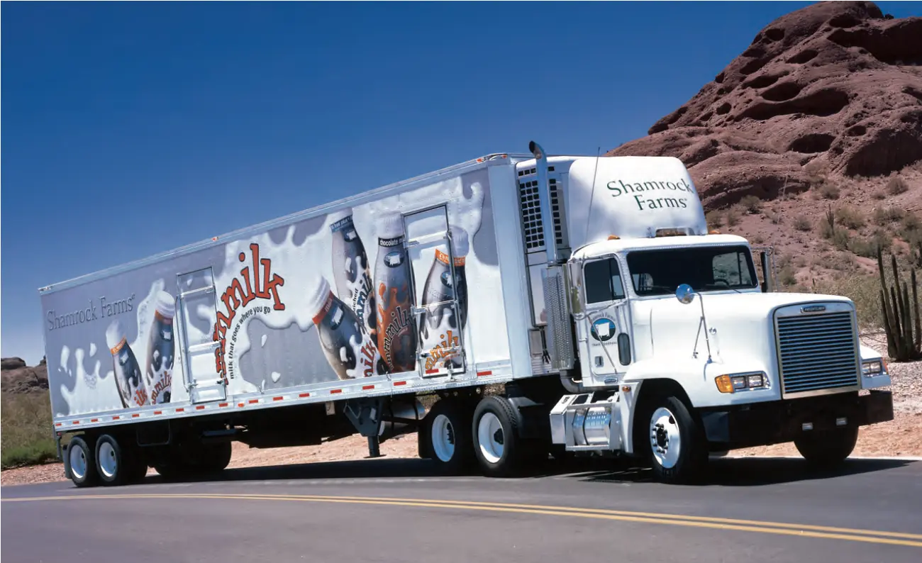
Shamrock saw a market opportunity to introduce an entirely new package design to replace the aging paperboard carton. Products in the dairy category had also been experiencing a decline in sales volume.
Introduce a new product name. Design and develop a proprietary, single-serve milk bottle and label. It should appeal to the target audience while delivering a convenience proposition.
Introduce a new package into the marketplace that does the following:
Shamrock’s mmmmilk packaging demonstrates that even with a commodity like milk, intelligent and creative design drives sales and revenues. Despite a higher retail price, Shamrock enjoyed increased sales up to 300% across all SKUs after the first six months.
Positioned primarily as a salad topping for over 10 years, Snapea Crisps branding lacked the strength to move beyond its limited product-usage perceptions to new line extensions and any significant sales growth.
Develop new brand position, product line name that allowed for future products under the new brand position, logo, and overall identity.
The base product line of four SKUs enjoyed modest repeat usage among a very small core of regular purchasers. However, in order to position itself among the retail trade and a broader consumer market, it needed to be repositioned for future line extensions and new products.
With a new brand position, Catapult’s naming process was employed and a new, overarching brand name [Harvest Snaps] was developed, tested among consumers, and IP trademark work was completed. It relaunched with new packaging. Initially, Harvest was subordinate to Snapea Crisps, but has since taken the lead brand role as other products were developed and introduced. These now include: Snapea Crisps, Lentil Bean, and Black Bean.
Calbee North America sought to rebrand and reposition the stagnant Snapea Crisps product line consisting of just four SKUs and less than $25MM in annual sales.
Develop new brand position and brand name that allowed for future products under the new brand identity, packaging, displays, and retail trade materials.
Introduce new branded products and plan for 30+ SKUs into the marketplace with no consumer advertising [television or print] and minimal trade spending in a heavy-spend category.
Calbee NA increased its retail business 500+% in three years since introduction of new packaging and brand and product designs. Harvest Snaps now includes three product lines: Snapea Crisps, Lentil Bean, and Black Bean.
Harvest Snaps’ average weighted ACV (All Commodities Volume) increased to 80% from 48%. Calbee NA received numerous trade awards for product innovation and package design.
Calbee NA’s Executive VP stated, “Much credit goes to Catapult. The new brand identity and packaging is the primary reason for our volume and sales growth, and overall success in the last three years.”

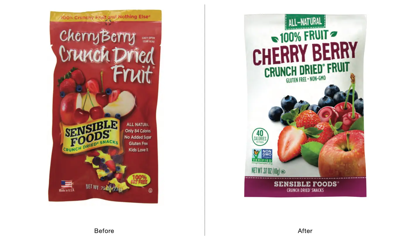
With declining sales and product value clearly under-marketed in the existing packaging, newly acquired Sensible Foods was in dire need of a brand overhaul.
Develop a new identity, packaging, retail and club store displays, and materials for sell-in to the trade. Design, program, and launch a new website with improved shopping capabilities. Leverage new identity for improved online presence and brand awareness.
Introduce seven new branded products across multiple SKUs into the marketplace with no consumer advertising [television or print] and minimal trade spending in the category of dried fruit snacks.
Catapult has enabled Sensible Foods to introduce 28 new sizes and flavors into retail and club store shelves in pouches that deliver real package power. This expanded line of healthy, freeze-dried, and delicious snacks in the dried-fruit category have put them on their way to tremendous growth. Catapult is currently developing packaging for a number of other new Sensible Foods products.
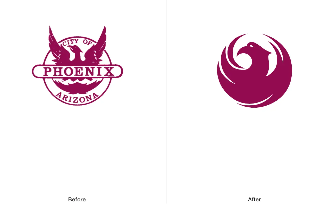
Phoenix was among the first municipalities in the US to recognize the value of their city as a brand. This began with a new logo and identity for of the City. Its iconic name served as the logical basis for a new logo.
Introduce new brand identity and communicate the descriptiveness of the City’s name and all it represents.
Leverage the positive heritage and perceptions of America’s 10th largest city (at the time). Consolidate the unregulated use of various derivations of Phoenix-like logos used across many city departments. Create brand standards for consistency, continuity, and cost management.
The logo design was selected from among many that were submitted by a handful of design firms from Arizona and out of state. Four finalists were presented in the newspaper and the public voted their favorite. A comprehensive graphics standards manual followed and eliminated the use of 12+ unauthorized variants across many City departments, thus saving $50,000 alone in the first year. Today, the City of Phoenix logo is among the most recognized municipal logos in the US and has become a cultural icon.
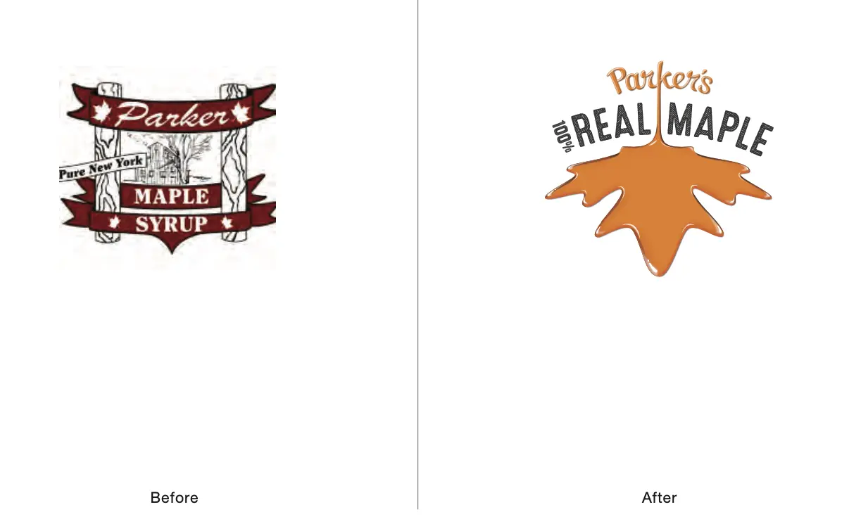
Josh Parker is a young, bright entrepreneur in rural upstate New York. At age 11 he produced his first real maple syrup. At 18 years old he developed Real Maple Butter and Real Maple Cotton Candy. With product in many small retailers, Josh reached out to Catapult when it was time to develop a new brand with real package power.
Develop a new brand and packaging that communicates and leverages Josh Parker’s vision for product innovation, authenticity, and the simple goodness of 100% real maple. Create packaging for six SKUs that can be sold into larger retail and club store accounts.
Break through the stodgy heritage of current maple syrup brands— imagery of buckets in tapped trees, log cabins, snow-covered wagons— and launch a contemporary brand that reflects the entrepreneur and remarkable product quality.
In 45 days, Catapult developed new branding and packaging for six new SKUs of maple syrup, maple butter, and maple cotton candy in preparation for key account presentations. His products in now thousands of retail stores in the U.S.
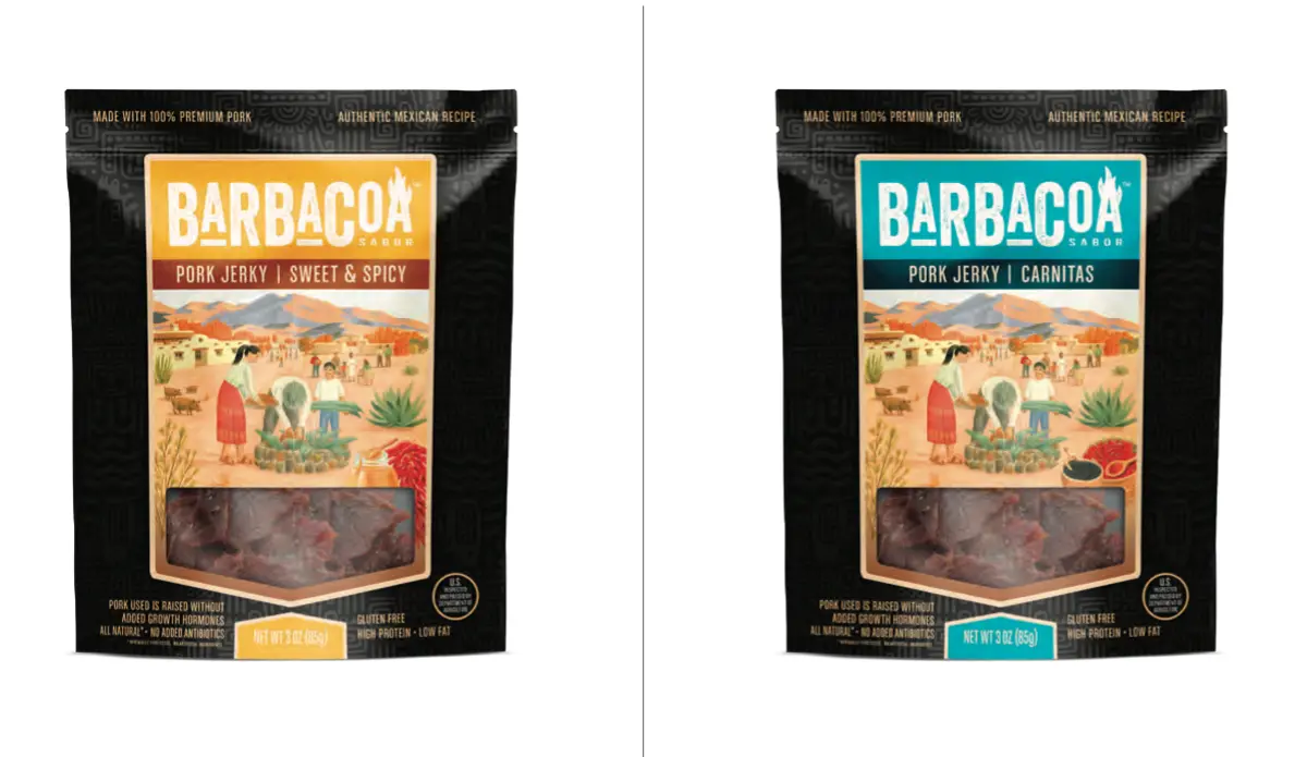
With the jerky snack category among the busiest and fastest growing in retail and club stores, Blend, LLC asked Catapult to develop a brand and packaging for a unique line of authentic Mexican flavored, barbacoa-style beef and pork jerky, Barbacoa Sabor.
Develop a new brand name, identity, and packaging that communicates and leverages authentic Mexican recipes and flavors across 15 initial SKUs for retail and warehouse stores.
Develop a brand and line of packaging that stands out in what has become a busy category with a growing number of players. Create a palette of colors that can be expanded as new flavors and jerky meats are developed.
Using strong typography, bold colors, original illustrations, and complementary graphics, five flavors in three sizes were developed; three beef jerky and two pork jerky. It’s been well received among the retail and club trade with sell in to key accounts..
Catapult provided sales comps/3D mockups for sell in presentations. As with other clients, Catapult also provided intellectual property assistance via our third-party patent attorney for trademark and trade dress protection.
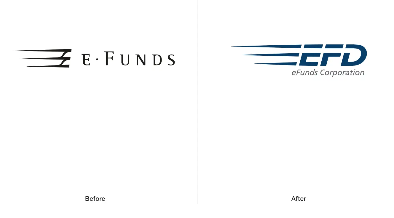
E-Funds needed a new name and identity—to create a brand that better reflected their product offerings and make them more competitive.
Develop new brand messaging, improve brand identity, marketing materials, and better connect employees and customers with the new brand.
Logo improvements must be modest to leverage the brand’s existing equity. Improve all marketing communications to elevate perceptions of product offerings. Engage visitors and employees with the brand at corporate HQ.
A new identity was launched and new marketing materials created. Developed branding program throughout HQ to engage visitors and employees at all touch points. The new, strengthened brand increased the company’s goodwill value and yielded a higher sale price in the subsequent corporate acquisition in 2007. Purchased by Fidelity National Information Services for $1.8 Billion or 3.25X of 2006 revenues.
Catapult Strategic Design has partnered with multiple well-known brands as well as smaller companies. We are proud of the work we have done for each one. Below is a list of additional companies our branding agency is proud to serve.
